You are using an out of date browser. It may not display this or other websites correctly.
You should upgrade or use an alternative browser.
You should upgrade or use an alternative browser.
Bukowski.net facelift (1 Viewer)
- Thread starter zobraks
- Start date
I guess it was too useful for its own good. :pwhy has that useful menue to the left gone?
That's the trouble with (almost) everything new (computer-related): the old functionality is often sacrificed for a new (arguably better) look.
mjp
Founding member
The stats tell me that a very large (and growing) percentage of visitors view the site on mobile devices. It's not the way I choose to meander the web myself, but that doesn't mean they can be ignored. The old site was frustrating and useless when you tried to view it on a tablet or, worse yet, a phone.
So it was re-done the way it was to accommodate mobile users without sacrificing or breaking anything for desktop users. Actually, I think the changes that were made to adapt to mobile make the site better on the desktop. The point of the site is to present images and text, and it does that better now than it did before.
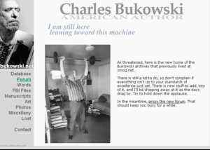
If you're feeling confused or nostalgic you can always look at these and fondly remember your youth:


Like Sky, I do like the picture. (but I also liked the old one.)
Maybe I shouldn't complain at all since I barely ever go to the home-page. But mjp's screenshots above say all I meant:
this menu in form of a column was much easier for a very fast grisp of what's on the site. (with one quick look that is)
To read all menu-items in a horizontal row takes more time as it is more 'sequential', if you see what I say.
of course I'm all for a smartphone-friendly design.
So, let's just get used to it, like all the times before.
mjp
Founding member
You could argue that the navigation sticking to the top of the browser window is more convenient than the old static navigation that you have to go hunting for if you've scrolled down.
A while back I looked at the numbers, what people click on in the menu, and that's why it was arranged the way it was (is). The stuff that was on the bottom - the things that are in the dropdown now - just aren't as popular. It's kind of the tail wagging the dog though, because if you make something more prominent in the navigation, it gets more clicks.
Speaking of which, I was actually thinking of an experiment to get more people to go to one of those less popular pages. Just by making the link more prominent and enticing. So I guess I'll do that now. Since you've reminded me.
The older I get, the harder it is to accept change. My wife changed our mailbox last week and it both confused
and irritated me. Like that. New pic is very cool, however.
and irritated me. Like that. New pic is very cool, however.
mjp
Founding member
No one likes it when a site changes. But we have to change or we end up like this.
Ok, that shit is funny.
Black Swan
Abord the Yorikke!
Love the new look. It is easier to get around.
Thank you!
Thank you!
I too like the new format. From a user standpoint, it's not all that different than the previous incarnation. What is just a bit unusual is the new photo on the homepage. Dare I say that Buk looks downright affable.
mjp
Founding member
FYI, numbers for the past couple of months - 32,000 new users on phones and tablets:The stats tell me that a very large (and growing) percentage of visitors view the site on mobile devices.
The problem with alienating them is they don't become old users. They come in, see the tiny text on the non-mobile-friendly site and bounce. There are other, more in depth numbers that show that bounce rate was twice as high for mobile users as for desktop.
Just imagine how many close friends of Mr. Zacharias/budding teenage Chicano writers/Far East English teachers/... have you lost.They come in, see the tiny text on the non-mobile-friendly site and bounce.
I almost (re)used the boxcar picture, but the world already thinks he spent his life in a boxcar, dead drunk, beating a whore and pissing his pants, so I figured it was time we gave him the renowned author treatment instead.
the best part of that picture is that he had to be helped up cause he couldn't do it by himself!
it is a false image, so you made the right choice.
What does that mean in non-techie lingo? Please to speak more slowly.
Thanks. Now, about this Y2K...
mjp
Founding member
Eh, not a fan of the "carousel" images you see on top of just about every corporate site in the world, or random images on refresh.
Don't get me wrong, the random image thing was really cool, you know, in 1998. But someone reloading a single page on your site just to see different pictures has lost most of its charm. Except maybe as a retro design feature.
Did you know that random image thing was originally written by someone looking for a clever way to inflate his site's visitor stats? Now you do. Your web design history lesson for the day.
Much prefer the new design. I never did care for the pissed in the pants looking photo - as a few people mentioned, it reinforced the skid row poet image. Everyone on this site knows there was so much more to Bukowski than that reduction.
Skygazer
And in the end...
Had a shot of my daughter's Nexus tablet, I like the way the front page/main site changes, so that if you have it
tall ways (portrait style?) you get a button to press for the drop down list (should please roni:)) whereas if you have the tablet width ways you get the
menu across the top - suiting everyone.
Also the photos page - some of the captions are hilarious, especially liked 47 and 48. But not sure if they are new?
Some of those captions are pretty funny. mjp must have paid someone to write them.
I too miss the old lay out and the unsightly social media icons are pretty disgusting, especially when put on the same page with buk... however I like the new picture, buk looks happy in it :)
bigger or smaller, I never noticed them before on the old one but the new layout is growing on me.
Similar threads
- Replies
- 2
- Views
- 2K
- Replies
- 22
- Views
- 13K
Users who are viewing this thread
Total: 2 (members: 0, guests: 2)
